Tipple
With unfiltered access to the world at your fingertips, what better way to wash down the heavy than with your favorite beer?
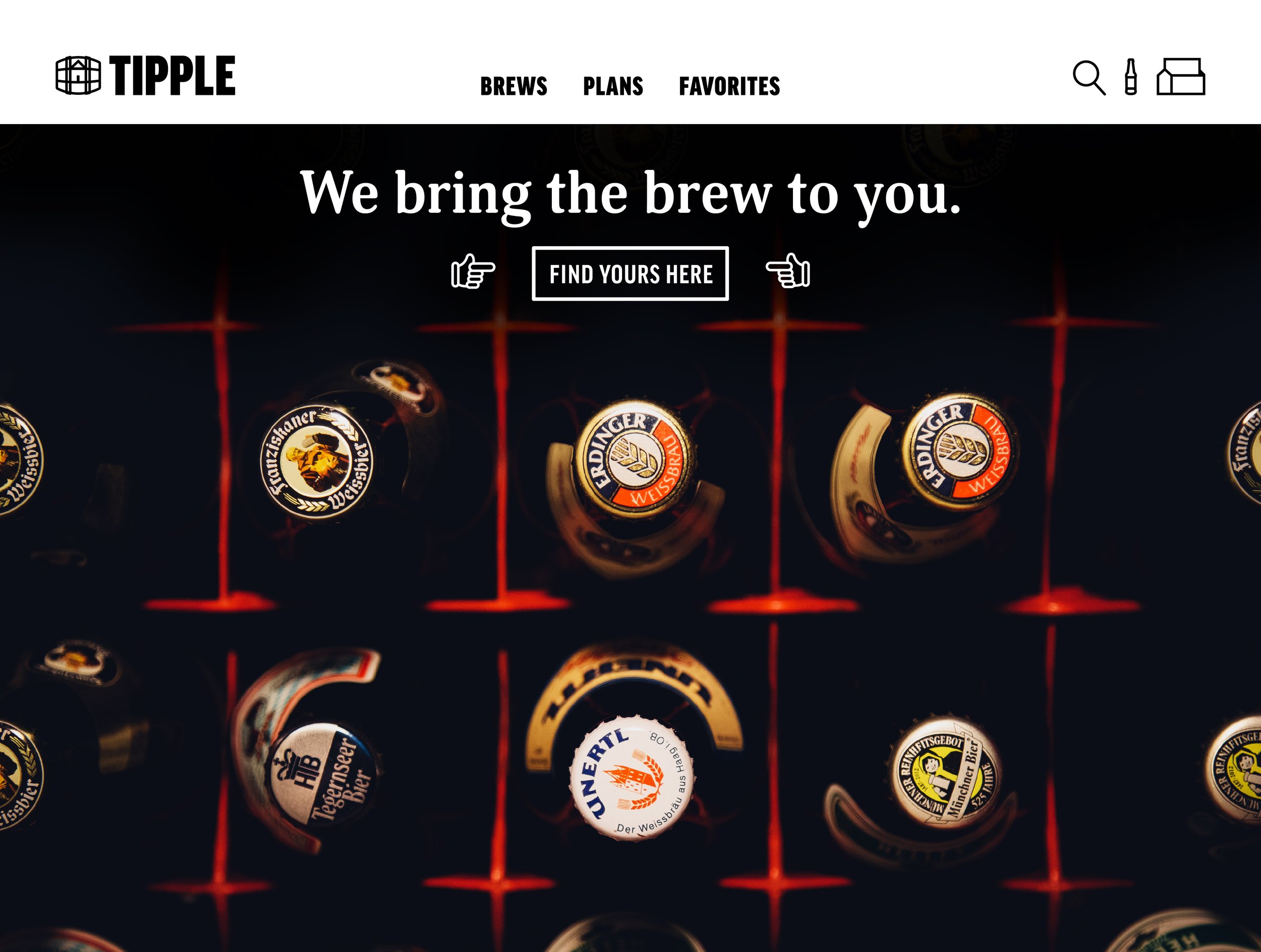
Tipple is a beer subscription tailored for your buds and your (taste) buds.
The challenge was to conceive the logo and style of this new service for avid beer drinkers and newcomers alike. The client was intent on including a barrel in the logo as a callback to the old days of drinking. This would pair well with the name of the company which is an old-timely word meaning to drink habitually.
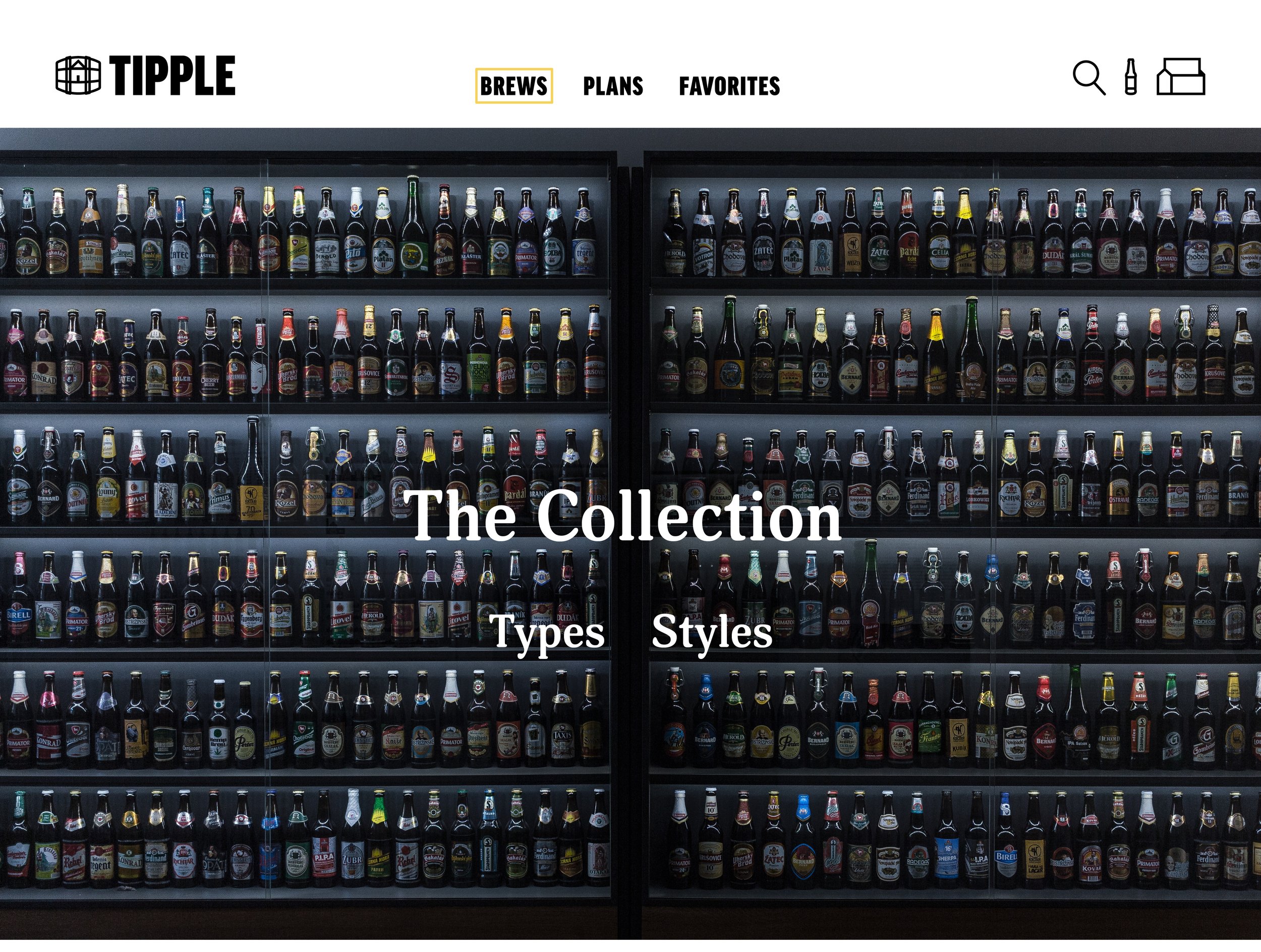
The solution became to use the funny nature of the word “tipple” as the foundation of the tone. With the tone being the driving force behind the company, the logo needed to be simple and to the point. A barrel of delivery with a home icon nestled into it was the perfect mark for Tipple.
For those looking to explore and broaden their palette, a simple & humorous questionnaire was created to understand the consumer and tailor the order accordingly. Instagram and OOH ads were created to reinforce message of the company.
Branding, Logo Design, Art Direction